Friday, June 15, 2012

Lab8: Los Angeles Fire of 2009


In August of 2009, a wildfire known as the Station wildfire broke out and set the Los Angeles County into a state of emergency. With flames reaching “300 to 400 feet” (Los Angeles Times), it is considered the largest wildfire in LA County’s modern history. It burned 160,557 Acres of the Los Angeles National Forest, destroying 209 structures and took 647 personnel to contain (Inciweb – 9640). Communities of La Canada-Flintridge, La Crescenta, Acton, Soledad Canyon, Pasadena and Glendale were evacuated due to the fire (Inciweb – 9360).The cost of fighting the fire was around $83.1 million (KTLA).
After reading reports, I became curious on why the fire was so difficult to handle. After some research, it was revealed that the fact that this was not a ‘wind driven’ fire was what made this fire special. Instead, the topography and the makeup of dry brush caused this extreme fire behavior. The “unusual mix of fuel, from chaparral and dry grass at lower elevations to pine at higher ones, coupled with record heat and slopes that are among the steepest of any mountain range in the country” (The New York Times) created a different type of fire than the wind driven fires that firefighters are more accustomed to handle.
I decided to examine for myself the linkage between the fuel distribution and the spread of fire for the Station Fire. The first map, a reference map, provided shows the extent of the Station Fire regarding the location in LA County. It is clear that, by the distribution of roads and highways, this fire burned quickly and fiercely in the mostly non-populated area of the LA County. The area is also very much in a higher mountain range as the digital elevation model demonstrates. The topology of the region would have made it very inaccessible for the firefighters to haul their equipment into as well as having so much variation in the height making it a difficult terrain to fight fires on.
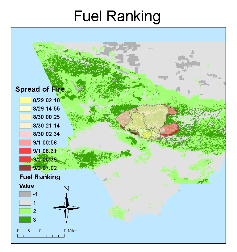
Using the Fuel Ranking data from the California Department of Forestry, I created a Fuel Ranking map and overlayed the spread of fire by time on top of it. First thing to notice is that most of the area underneath the area burned has a rank of 3, and the rest has a rank of 2. With higher ranked fuels having more energy to burn, it is evident that the fire followed this pattern by engulfing the fuel rich areas. Looking at the spread of the fire by time on top of the fuel ranking provides more insight into where the fire chose to spread. The fires started at the south part of the total areas burned and quickly spread north towards the directions of higher fuel rankings. This direct correlation was what the reports were referring to as the dry chaparral that fueled the fire instead of wind.
Because of this non wind driven fire, “L.A. County Fire and Forest Services said they would change their procedures so that both agencies would immediately fight to extinguish any fire in the southern portion of the Angeles National Forest so that future fires don't become as massive and dangerous as the Station Fire.” (KTLA) As it can be observed in the maps I created, the Station fire served as a very costly reminder that the fire can be just as much damaging without the presence of the wind.

Archibold, Randal. (2 September 2009). “California Fire Is Pushed Back.” The New York Times. Web. 13 June. 2012. http://www.nytimes.com/2009/09/03/us/03fires.html?_r=1
Bloomekatz, Ari B. (2 September 2009). “Station fire is largest in L.A. County's modern history.” Los Angeles Times. Web. 13 June. 2012. http://latimesblogs.latimes.com/lanow/2009/09/station-fire-is-largest-in-la-county-history.html
"Station Fire Evening Update Aug. 31, 2009." inciweb.org. Web. 13 June. 2012. http://inciweb.org/incident/article/9360/
“Station Fire Update Sept. 27, 2009.” Inciweb.org. Web. 13 June. 2012. http://inciweb.org/incident/article/9640/
(2 October 2009). “Report: Number of Firefighters Reduced Before Station Fire.” KTLA News. Web. 13 June. 2012. http://www.ktla.com/news/landing/ktla-angeles-fire,0,5292469.story

Friday, June 1, 2012

Lab 7


This map shows clearly the distribution of Black population in the US by county. It is very evident that there are a lot of black concentrated counties in the South compared to the rest of the country. There are counties with less than 1 percent reported black population that there is no data available (represented by white). The history of the black population in United States is reflected in current day’s population distribution.


The percentage of Asian population by county is shown in the map. Even the most concentrated counties have less than 50% of the population identified as Asian. Because the West coast is closer to Asia through the Pacific Ocean, it is logical that many of them settled on the West coast such as California and Washington. Especially because of the shorter history of immigration compared to other races, the spread of the Asian population into the rest of the continental US is low, with the exception of couple major cities such as New York.


The Other Races population percentage map shows the races not classified as follows: "White", "Black or African American", "American Indian and Alaska Native", "Asian" and "Native Hawaiian and Other Pacific Islander". From the look of the distribution, an educated guess can be made that this mostly consists of Hispanic population in the United States. Many of the counties near the US/Mexico border have higher percentage of “other races” while counties further North have lower percentages. Again, with the exception of major places such as Tristate area and Florida, the rest of the continental US has low spread of the ‘other races’ population.


The census map series and the experience with ArcGIS have been very beneficial. It was very interesting to visualize the data that I grabbed from an outside source, convert it into tables, joining them with the shape data in order to make meaning out of the data. The maps I created clearly show the distribution of population for specific races. From that, I could make inferences and search for the reason behind that, connecting it back to history. I think this lab was very useful in practicing working with data tables and analyzing the data in a different way that I could not do with just an excel file. It really showed the power of GIS that was not allowed without the geographic data.

Thursday, May 24, 2012

Lab 6: DEMs in ArcGIS

 
The following is the DEM Data of Grand Canyon. As one of the seven natural wonders of the world, Grand Canyon is a steep-sided canyon carved by the Colorado River in the United States in the state of Arizona. Because it has such drastic change in elevations due to the fissure, it was a good choice to do analysis on the elevation data. The Range of elevation changes are conspicuous in the 3D model of the area. The Shaded Relief Model shows the layout of the region, we can easily spot where the Colorado River flows through. The Slope map shows where the most drastic changes of slope are located. Finally, the Aspect map makes it clear to spot the vastness of the Grand Canyon visible in all directions. The four images gives us a vivid picture regarding the region about the geographical features of Grand Canyon.


----Extent----
Top: 36.4361111103
Left: -112.407222223
Right: -111.689444445
Bottom: 35.8655555548

---Geographic Coordinate System---
GCS_North_American_1983
Angular Unit: Degree (0.017453292519943295)
Datum: D_North_American_1983


3D Image


Friday, May 18, 2012

Lab5: Projections in ArcGIS


This lab exercise greatly demonstrated the importance of map projections. First thing I noticed was the distortions present on each map. Because the world is in three dimensions, and maps are in two dimensions, distortions exist when projecting the world onto a map. There exist three major categories of projection (based on the geometric properties they keep): Conformal, Equal Area, Equidistant. Conformal map projections preserve angles locally; examples are Mercator and Eckert I. Equal Area map projections preserve area; examples are Goodes Homolosine and Bonne. Equidistant map projections preserve distance from some standard point or line; examples include Azimuthal equidistant and Two-point equidistant.
The most important thing when looking at a map is to find out which of those properties the map keeps; this helps the understanding of the purpose behind the map and can be utilized accordingly. For example Mercator and Eckert I, conformal maps which keeps the angles are suited for navigations rather than settling area disputes (Antartica looks bigger than the other continents combined on the Mercator projection). For a dispute regarding area, Equal Area projections are much more suited than other projections. Goodes Homolosine shows the continent of Africa is bigger than Antarctica unlike on the Mercator projection. The Equidistant map keeps equal distance properties based off of its set standard, so it is not suited for measuring distance from one random point to another on the map, but rather is used for more specific measurements related to that standard.
While trying to find the distance between the two cities, Washington D.C. and Kabul, I found out that these distortions caused a great deal of errors. For example, a straight line distance on a Mercator projection (Conformal) was about 10,112 miles, when the correct distance is 6,934 miles. None of the six maps gave a close enough measurement in straight line. The lack of this knowledge can potentially cause great disaster. With the increasing prevalence of amateur uses of maps, the danger for spread of wrong information through the web without any authoritative verification increases.
I think the equidistant maps best demonstrate the purpose of this lab. To use the maps based on the purpose and the properties they are meant to be used for. Equidistant projections, for example have such a specific usage that it did not seem logical to me what the name “equidistant” meant at first. They exemplify why certain types of map projections are better than others for different purposes. Yet just by the name “equidistant” it gave me the wrong idea that the distances between random points would somehow be conserved; the idea which soon became clear to me that it was not feasible. This exercise clearly demonstrated the dangers that one might face if one is not careful with the use of the maps.


Friday, May 11, 2012

Lab4: Introducing ArcMap


ArcMap Experience + Potential and Pitfalls of GIS:

As this was my first experience using the ArcMap software, I must say it was an interesting experience. When I first started the program and following the guide, I was intimidated by the amount of things that the program allows the user to do. But as I stepped through the tutorial, I realized that the program was actually very well organized. I guess that is expected of a program that has been through 10 major versions. The tutorial was very easy to follow, and I was able to create an awesome looking map in just 2 hours. The way that the program manages information just left me in awe of it after I looked at the map I exported.

There is a lot of potential in ArcMap software that is very beneficial for a user to take advantage of. First is that manipulation of data was very easy. It allows the user to access the database and display it in a meaningful way without the need to understand how the data is stored. The hundreds of options for each task really simplify the tasks to be done by the user, creating a very user-friendly access to the world of GIS. Examples of these include drawing tools, as well as calculation tools that really made me say, ‘wow’.

The one pitfall of the ArcMap software I noticed is the sheer size of the program. In trying to load the database and manage it, the program took a long time to load in the beginning. The machines at the lab, as well as remote accessing to the lab, made me feel uncomfortable whenever the program stalled. Although I did not experience any data loss though frequent saving, absent the habit, I would have had to start over. Another pitfall of the ArcMap software is that there still is a high learning curve. After going through the 56 page tutorial, I feel that I only know the very small portion of the software mentioned in the tutorial. The portion of options I have used/understand versus the options I do not understand is just amazingly high. I think a user will need to use this program for months before fully understanding what each part does.

Overall, I think ArcMap is a very powerful yet flexible GIS tool. It is user-friendly while being very robust and full of options. The program seems flawless on first try (provided that it is run on a powerful machine). I think I understand why ArcGIS dominates the market after only using it once.

Friday, April 27, 2012

Lab3: Neogeography


As a neogeography project, I decided to make a map of places in the greater San Diego area that intrigues me. I visit San Diego quite often because of friends at UCSD. There is beautiful scenery by the Mission Bay Park as well as magnificent tourist destination, SeaWorld. Watching the sunset from coastlines of Coronado is by far the most amazing place I have ever been to. From the famous Chili Fries from Lolita's to 40oz porterhouse for two at Cowboy Star, San Diego also has my favorite restaurants. There are also other attractions such as the USS Midway museum, an Aircraft Carrier-turned museum that demonstrates the immense scale of the US Military protecting freedom around the world.


View My Visits to San Diego in a larger map


    Neogeography is the geo-spatial side of Web 2.0. User-created content combined with existing maps to give meaning and share spatial information with other users. Neogeography embodies the idea that spatial knowledge contains a personal meaning.
    Although neogeography is widely accepted and appreciated, as with anything, there are some downsides to this idea. One of the major pitfalls of neogeography is misinformation. Since there is no regulating agency (such as USGS) there is a great amount of discrepancy regarding the information presented by neogeography. Unlike GIS, where qualified individuals go to great depths to catch and correct wrong information, neogeographers (many of whom are amateurs like me) may present wrong information regardless of malicious intent. Also, since there are no requirements or set regulations, every user follow their self-made guidelines (if any). This leads to a map that is very difficult to read and interpret. Another major disadvantage of neogeography is the loss of privacy. Due to the fact that many neogeography maps contain personal meaning to the space around us, there is a possibility of great leak of personal information. Since anyone who accesses this blog (made public) can access my map (made public by following the link), they can predict where I will be when I visit San Diego without my knowledge.
    Regardless of these downsides of neogeography, it still stands as a positive symbol of personal understanding of spatial information. I don’t see it too distant in the future when users will start to tag their pictures and videos based on location, which will allow for another type of social-spatial analysis. It also serves a way for people like you and me to get interested in maps as a whole, and moving to a more sophisticated study such as GIS. The flaws mentioned above can be reduced by implementation of a bit of regulations and safety mechanisms.


Friday, April 20, 2012

Lab 2: USGS Topographic Maps


1. What is the name of the quadrangle?
      Beverly Hills, CA

2. What are the names of the adjacent quadrangles?
     Canoga Park, Van Nuys, Burbank, Topanga, Hollywood, Venice, Inglewood

3. When was the quadrangle first created?
    1995

4. What datum was used to create your map?
    National Geodetic Vertical Datum of 1929

5. What is the scale of the map?
    1:24000 Scale

6. At the above scale, answer the following:
            a) 5cm on the map is equivalent to how many meters on the ground?
                 0.05*24000 = 1200 meters

            b)  5in on the map is equivalent to how many miles on the ground?
                 5*24000/63360 = 1.894 miles

            c)  One mile on the ground is equivalent to how many inches on the map?
                 63360/24000 = 2.64 inches

            d)  Three kilometers on the ground is equivalent to how many centimeters on the map?
                 3000/24000*100 = 12.5 cm

7. What is the contour interval on your map?
    20 ft

8. What are the approximate geographic coordinates in BOTH degrees/minutes/seconds and decimal degrees of:
            a)  the Public Affairs Building;
                 34º3'57"N 118º26'11"E
                 34.066º N 118.436º E

            b)  the tip of Santa Monica pier;
                 34º27"N 118º29'56"E
                 34.008º N 118.499º E

            c)  the Upper Franklin Canyon Reservoir;
                 34º6'13"N 118º24'58"E
                 34.104º N 118.416º E

9. What is the approximate elevation in BOTH feet and meters of:
            a)  Greystone Mansion (in Greystone Park);
                 560ft = 170m

            b)  Woodlawn Cemetery;
                 140ft = 42m

            c)  Crestwood Hills Park;
                 620ft = 189m

10. What is the UTM zone of the map?
      UTM Zone 11

11. What are the UTM coordinates for the lower left corner of your map?
       3763000,361400

12. How many square meters are contained within each cell of the UTM gridlines?
       1,000,000 m^2

13. Obtain elevation measurements, from west to east along the UTM northing 3771000, where the eastings of the UTM grid intersect the northing. Create an elevation profile using these measurements in Excel (hint: create a line chart). Figure out how to label the elevation values to the two measurements on campus. Insert your elevation profile as a graphic in your blog.
     

14. What is the magnetic declination of the map?
     14 Degrees

15. In which direction does water flow in the intermittent stream between the 405 freeway and Stone Canyon Reservoir?
      The water flows south from higher elevations at the top of the river to lower elevations at the bottom of the river.

16. Crop out(i.e., cut and paste) UCLA from the map and include it as a graphic on your blog.